Loading article
Investigation
Who flies the most, and where?
Three months of public ADS-B data, mapped against schedules, tour dates, and depositions.
By celebplanes · 6 min read
The question sounds simple. It is not. "Who flies the most" depends on what you count — number of flights, hours in the air, or fuel burned — and each metric crowns a different winner. Over three months of public ADS-B broadcasts, cross-referenced against tour calendars, earnings-call schedules, and the occasional court filing, the same dozen registrations surface again and again. Here is what the data actually shows, and what it cannot.
By raw flight count, the leaders are rarely the household names. Corporate flight departments — the aircraft registered to holding companies rather than to a person — run the densest schedules, shuttling executives between a headquarters and two or three regional hubs on a weekly rhythm. These are the jets that log 200-plus movements a year without ever trending. They are also, per flight, the least interesting: a Gulfstream that flies the same triangle every Tuesday tells you about a company, not a person.
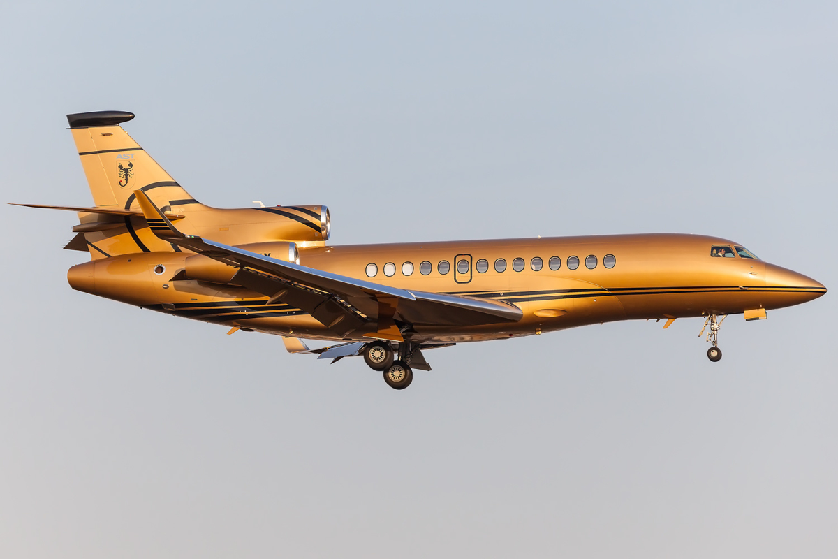

By hours and by fuel, the picture tightens around a smaller group. The heavy long-haul jets — the Global 7500s, the G650s, the Falcon 7Xs — burn two to three times what a midsize does per hour, so a single transatlantic leg outweighs a week of short domestic hops on the emissions ledger. This is where the familiar names return. The Falcon 7X long associated in public reporting with the Nashville–Los Angeles corridor is the canonical example: a heavy jet on a route it flies often enough to have a nickname.
That aircraft is also, in a sense, why this whole genre exists. The 2022 Yard analysis that kicked off the modern celebrity-jet news cycle ranked the Taylor Swift registration first among the celebrity emitters it studied — roughly 8,300 metric tons of CO2 across some 170 flights in seven months, a figure driven as much by the number of legs as by their length. By 2023, after one of the two jets in that fleet was sold, the same name had dropped out of the top thirty. That swing — first place to unranked in a year, on the strength of a single airframe changing hands — is the most important thing to understand about these rankings. They are volatile, and they measure aircraft, not guilt.
The short-hop flights are the ones that travel. A twelve-minute leg between two airports an hour apart by car is the single most reliable way for a registration to end up in a headline, because the optics need no explanation. Our scoring reflects that: a sub-250-nautical-mile flight by a well-known registration is flagged as newsworthy precisely because the distance is the story. But the raw emissions from a twelve-minute hop are small. The paradox of the coverage is that the flights people share are rarely the flights that matter to the total, and the flights that dominate the total — long, routine, transoceanic — rarely get shared.
Geography clusters hard. The registrations we track concentrate on a handful of nodes: the Los Angeles-area fields at Van Nuys and Burbank, the New York metro at Teterboro, South Florida at Palm Beach and Opa-locka, and a scatter of home bases — Nashville, Austin, Seattle — that map onto where wealth lives rather than where it works. Teterboro on a summer Friday afternoon is, by movement density of tracked tails, about the busiest single point in the dataset. The "where" answers itself: between money and more money.
A caveat we repeat because it matters. Everything here describes an aircraft's movements, not a person's whereabouts. A registration flying Nashville to Los Angeles tells you the airframe made the trip; it does not tell you who, if anyone, sat in it. Owners charter their jets out, lend them, and fly empty repositioning legs. We frame every flight as an aircraft movement and treat the question of who was aboard as speculation, because from public ADS-B data that is exactly what it is.
So: who flies the most? Corporate fleets, by count. A small club of heavy long-haul jets, by fuel. And whoever happened to take the shortest, most photographable hop that week, by attention. The three answers rarely point at the same tail — which is the whole reason we keep the live map, rather than the leaderboard, as the primary document.
End of article · celebplanes